I like it and its a contender it will be voted on but you need to remove the "One Dollar" and "United States of America" Put the date 2010 and you have a great submission
I like the obverse alot - you can try with UNITED STATES OF COINSAREFUN // ONE GREAT FUN (instead of DOLLAR)
Keep trying
Reply #51
by FilthyBroke on 22 Sep, 2010 14:21
How about a series of American landmarks? Just a thought....
Reply #52
by coinsarefun on 22 Sep, 2010 14:25
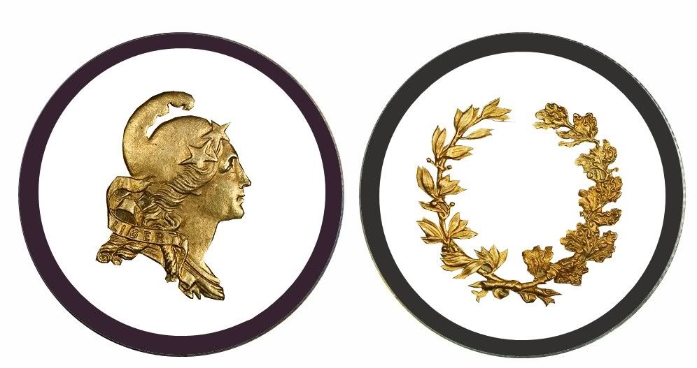
Does anyone want to try working with this one?
Reply #53
by Rigos_Place on 22 Sep, 2010 16:50
Removed lettering and replaced date.
For Fun, Don't Sue Me....LOL
Reply #54
by FilthyBroke on 22 Sep, 2010 17:12
I like how you did the lettering on the conder. Was it difficult?
I like how you did the lettering on the conder. Was it difficult?
Very difficult. This was actually my first time trying anything like it so it took me a couple of hours, seriously! a couple of hours. Good thing I didn't have training today, no kids and no garden work
I'll try to make a couple more tomorrow and play with GIMP to see what I come up with now. Maybe some of Stef's toners with weird lettering. I don't know, we'll see what my head thinks of making.
BTW, thanks and I'm glad you liked it.
I bet it took some time! I'm going through the same ordeal, working with this editing software. Pretty cool, though. Looking forward to seeing more!
Reply #57
by FilthyBroke on 22 Sep, 2010 20:04
Oh, and here's a special one (for me). It's a design that I've looked for but haven't come across again since the first one I saw and missed out on. I made this one just to show, really. I just love the port scene, and of course the ship!
The obverse is basically intact and almost as minted, minus the lettering and a couple of adjustments for sizing. The Reverse is just something I threw together to try to match the style.
Reply #58
by LotsoLuck on 22 Sep, 2010 21:52
Some nice designs here I really like the ship port scene Filthy Broke, I guess i'll put my pencil and paper down now
I like how you did the lettering on the conder. Was it difficult?
Very difficult. This was actually my first time trying anything like it so it took me a couple of hours, seriously! a couple of hours. Good thing I didn't have training today, no kids and no garden work
I'll try to make a couple more tomorrow and play with GIMP to see what I come up with now. Maybe some of Stef's toners with weird lettering. I don't know, we'll see what my head thinks of making.
BTW, thanks and I'm glad you liked it.
Rigos - nice work - I use gimp myself - PLEEEEEEEASE would you be so nice and share what function did you use to make that lettering. Or did you crop and turn every letter separately as a new layer.


 I really like the ship port scene Filthy Broke, I guess i'll put my pencil and paper down now